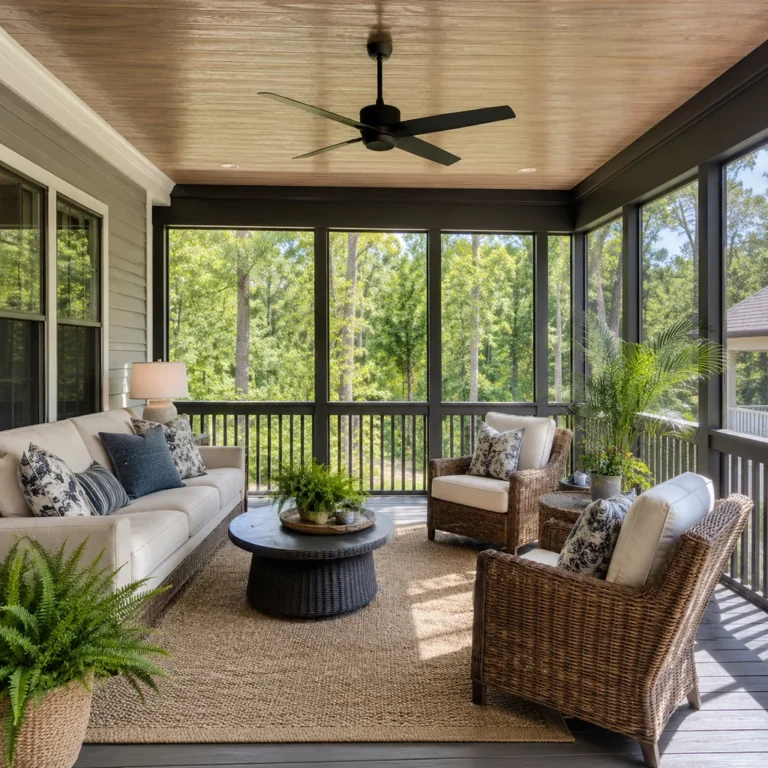
28 Living Room Mistakes That Make Your Home Feel Smaller and Less Welcoming (And the Fix for Each)

Interior designers can walk into any living room and spot the mistakes within 30 seconds — start at 28, because #1 is the one most people never fix.
28. All the Furniture Pushed Against the Walls
It feels like the logical thing to do — push everything back to make the room feel bigger.
It doesn’t. It makes the room feel like a doctor’s waiting area, with everyone perched on the edges staring at the void in the middle. A room with furniture floating away from the walls — even just 12 to 18 inches — instantly feels more intentional and livable.
Pull the sofa forward. Let the room breathe toward the center, not away from it.
The wall is not the sofa’s natural habitat.
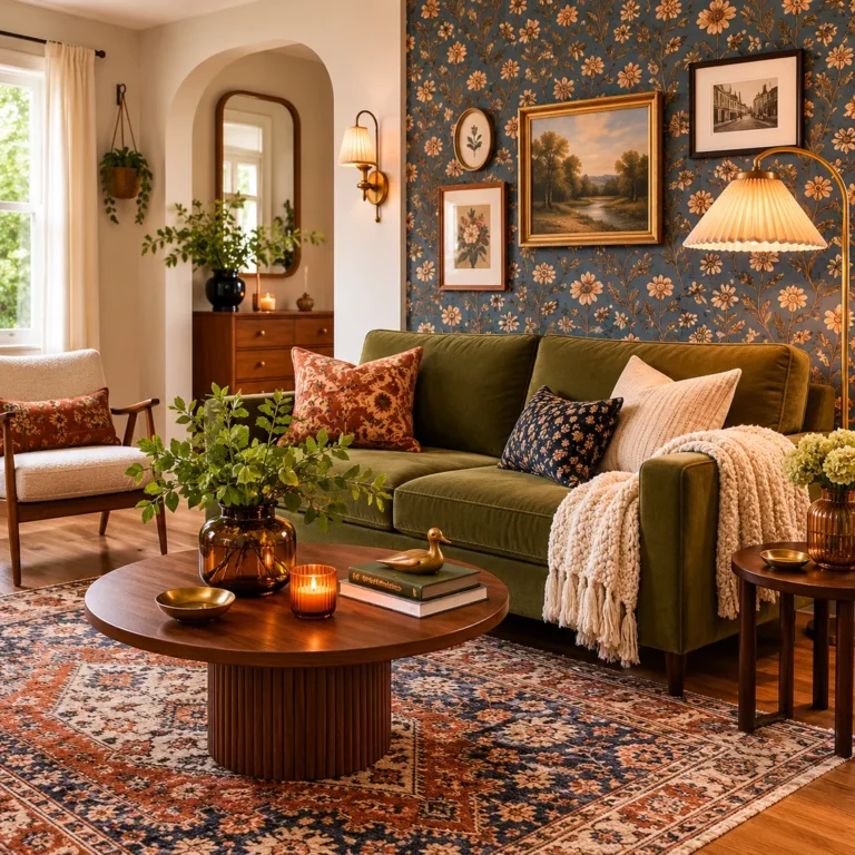
27. Area Rug Too Small for the Furniture Grouping
Interior designers call this the most universal mistake in residential living rooms, and they mean it.
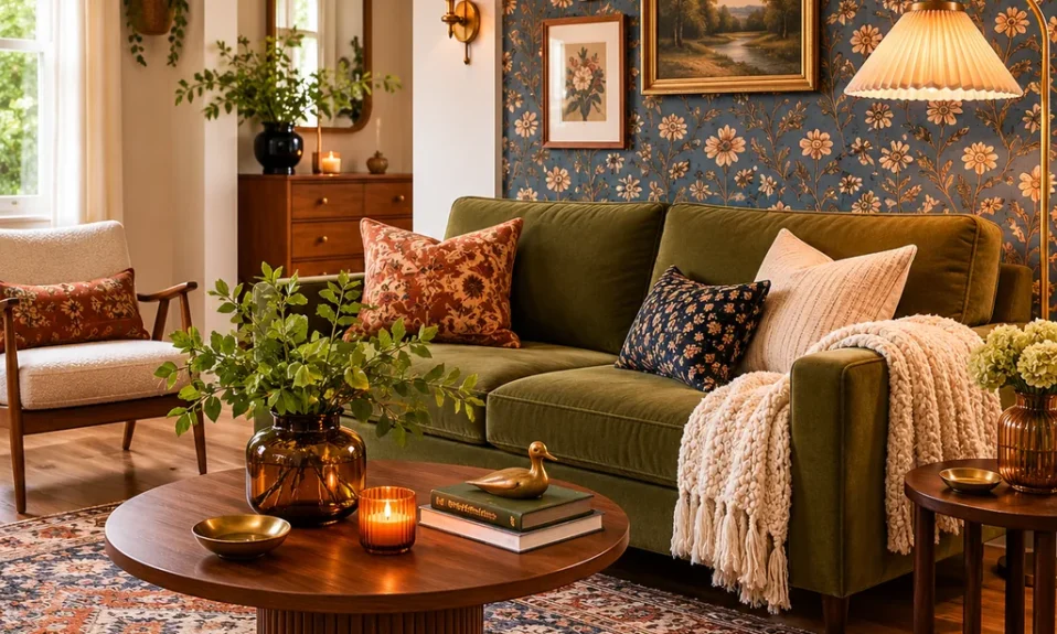
The rug is sitting in the middle of the room like an island no one can reach. The furniture legs float around it on bare floor, and nothing feels connected. The fix is almost always going up one size: if you bought a 5×8, you probably needed an 8×10. All front legs of the sofa and chairs should sit on the rug.
When the rug is the right size, everything in the room looks like it belongs together.
You’ll be stunned what one rug size change does to a space.
26. Only One Overhead Light Source With No Layers
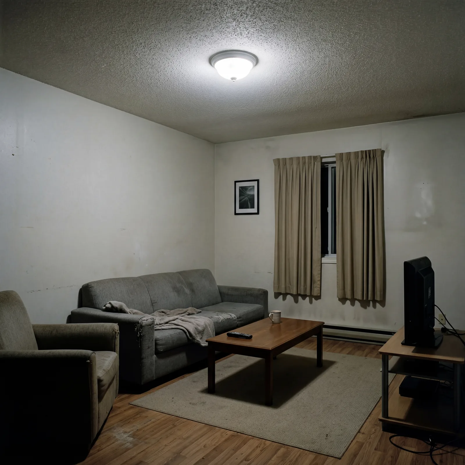
One overhead light makes every room feel like an interrogation room with better furniture.
The light comes from above, casts shadows downward, flattens everything, and gives the space the ambience of a break room. Layered lighting means at least three sources at different heights: overhead, table lamp level, and something lower or accent-based. This can cost as little as $40 in lamps from a thrift store.
The switch from flat to layered light is the fastest visual transformation you can make in a room.
Flat light is the enemy of atmosphere.
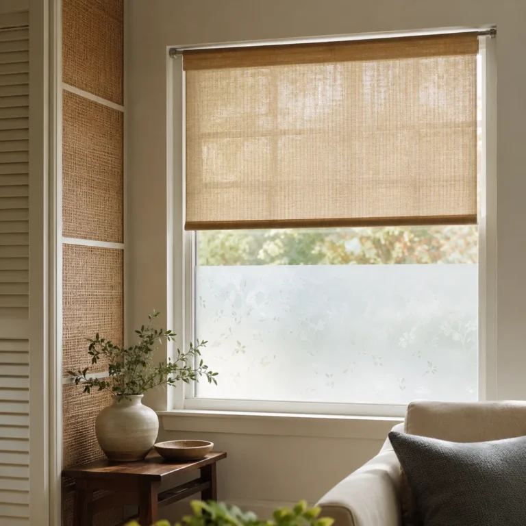
25. Window Curtains That Don’t Reach the Ceiling or Floor
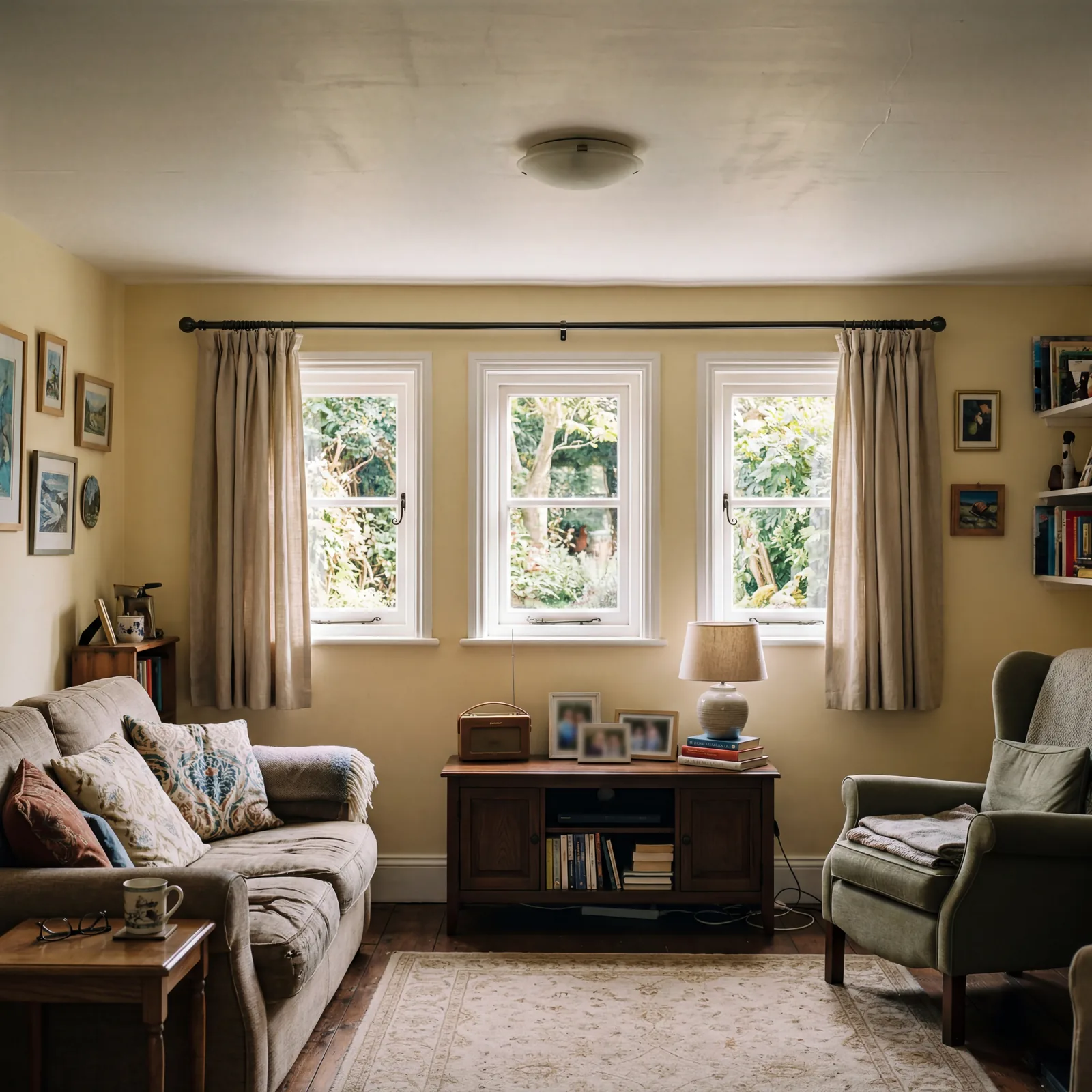
Short curtains are the single fastest way to make your ceiling look lower than it is.
When the rod sits just above the window frame and the curtains stop 6 inches from the floor, the eye reads “low ceiling” even if the ceiling is perfectly normal height. Hang the rod 4 to 6 inches below the ceiling and let the curtains fall to within half an inch of the floor. The same windows look twice as tall.
You don’t need new curtains. You often just need a higher rod.
The curtain is doing more architectural work than you think.
The next five mistakes are in almost every living room over 15 years old.
24. Too Many Throw Pillows in Clashing Patterns
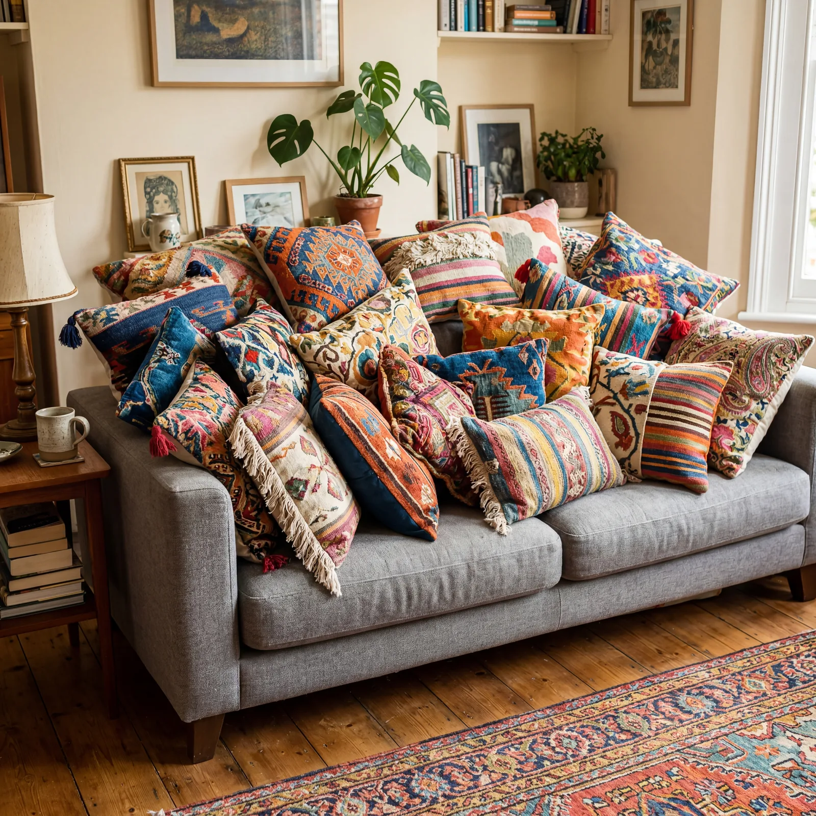
The pillow collection grew gradually, and now it’s running the room.
Every pillow represents a different moment of inspiration — a trip, a sale, a season — and together they’ve turned your sofa into a visual argument. The fix isn’t to throw them out. It’s to edit down to two patterns maximum with a solid as a third, and keep the palette within three colors. That’s the whole rule.
Fewer pillows, chosen intentionally, make the sofa look like it belongs in a magazine.
The room can’t have a personality if everything is competing for attention at once.
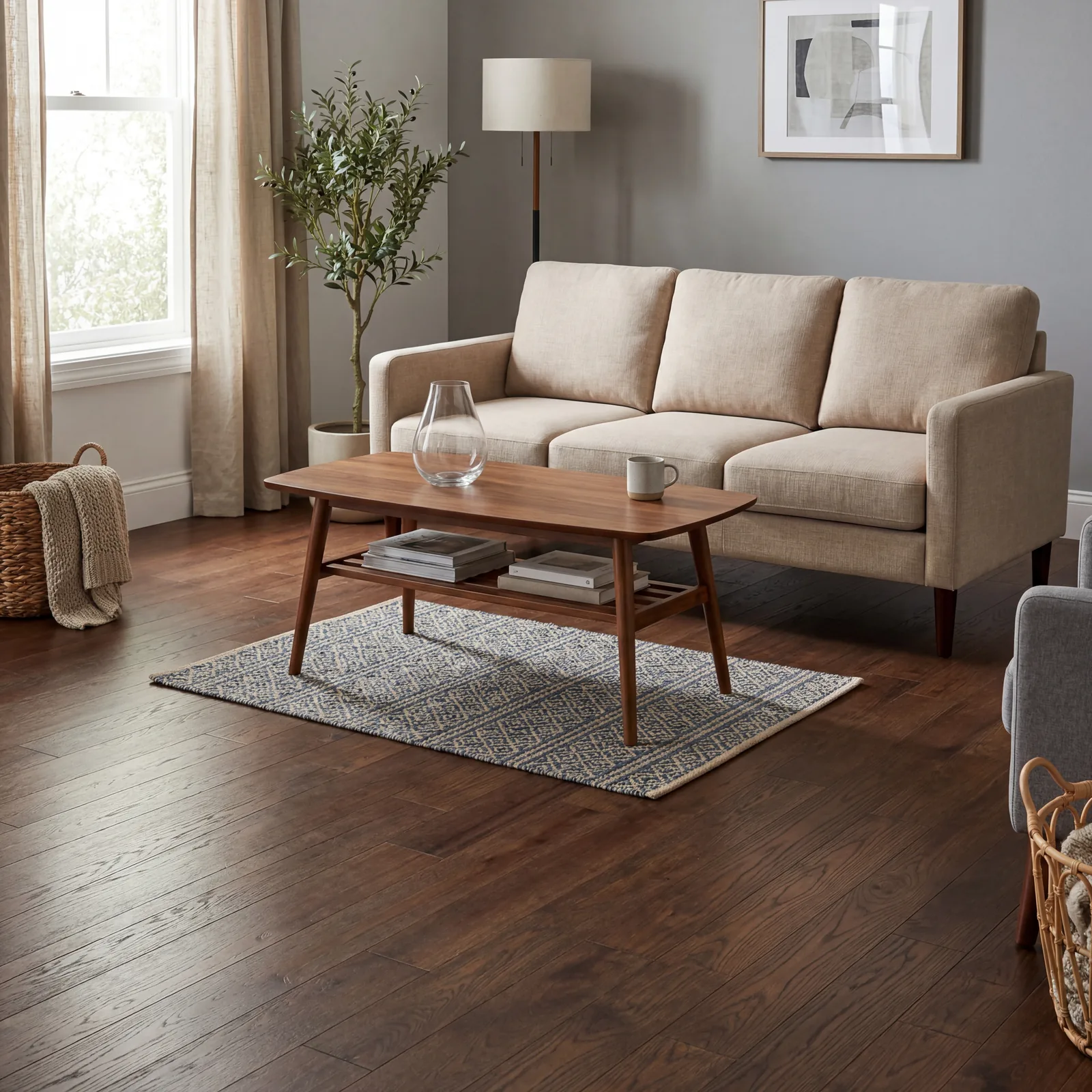
23. Coffee Table Too Small or Too Large for the Sofa
Scale is the invisible grammar of a room, and the coffee table is where most people get it completely wrong.
A tiny table in front of a large sofa looks like it wandered in from another room. A table that dominates the space makes the sofa feel trapped. The rule: your coffee table should be roughly two-thirds the length of your sofa and sit 14 to 18 inches from the front edge. That distance matters as much as the size.
When the scale is right, people stop noticing the table and start noticing how comfortable the room feels.
Scale off by even a little reads as “something’s wrong” to every person who sits down.
22. All Furniture at the Same Height With No Visual Variation
A room where everything sits at the same height feels like a spreadsheet.
Your eye needs something to travel along — up, across, down, then up again. That movement is what makes a room feel rich and interesting rather than flat. Mix a low sofa with a taller bookcase, a floor lamp that reaches near the ceiling, a lower ottoman. The variation doesn’t need to be dramatic, just present and deliberate.
An eye that has nowhere to go stops looking — and that’s when a room feels boring.
Visual rhythm is what separates a furnished room from a designed one.
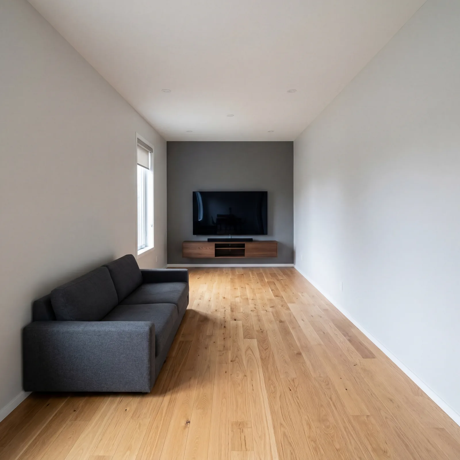
21. Television Mounted Too High on the Wall
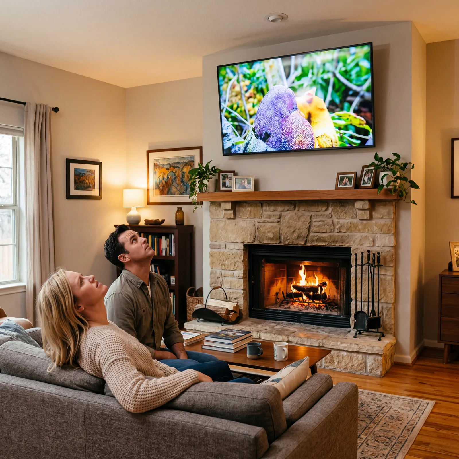
Everyone who installs a TV above a fireplace at eye-with-the-mantle height deeply regrets it within a week.
Looking up at a screen for two hours causes neck strain, headaches, and a peculiar feeling that you’re watching a presentation rather than relaxing. The center of the screen should sit at roughly eye level when seated, which is typically 42 to 48 inches from the floor. That’s probably lower than yours is right now.
Lowering a mounted TV is a one-hour fix that changes how a room feels to use every single day.
Your neck is more important than the aesthetic of a high mount.
This next one is where most people’s living rooms quietly fall apart.
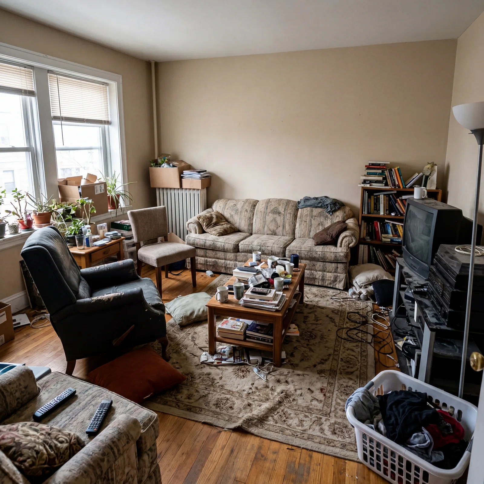
20. Too Much Clutter on Every Surface
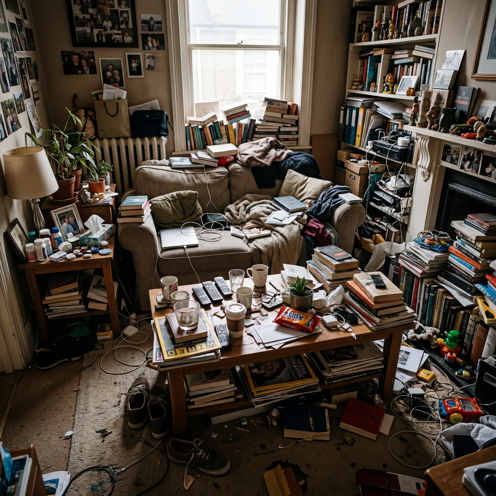
When every surface is full, the room never lets you relax.
Your brain reads clutter as unfinished business. The coffee table covered in remotes, magazines, coasters, and ornaments; the side table stacked three things deep — it all signals “there is work to do here.” Clearing one full surface completely in a living room is a psychological shift you’ll feel immediately.
The rule in good design: every surface needs at least 40% clear space to feel intentional rather than accumulated.
Rest is something a room has to give you permission for — and clutter withdraws that permission every time.
19. Artwork Hung Too High
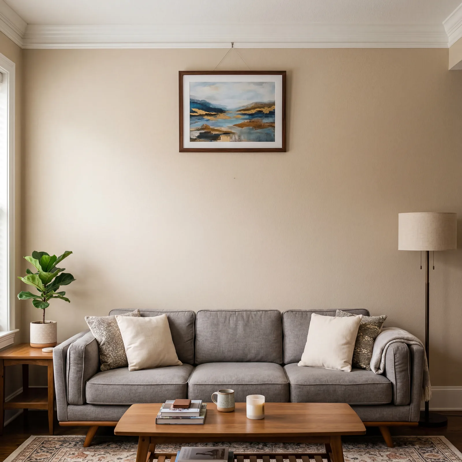
Almost every piece of art in almost every home is hung too high. It’s one of the most consistent mistakes designers encounter.
The gallery standard is 57 to 60 inches from the floor to the center of the artwork — which is roughly average eye level when standing. Most people hang art at their own eye level while standing, which pushes it 4 to 6 inches too high. Art hung correctly looks like it’s in conversation with the furniture. Art hung too high looks like it’s avoiding it.
Get a tape measure. Check your most important piece. You’ll almost certainly be moving it down.
Good art placement costs nothing and changes a wall completely.
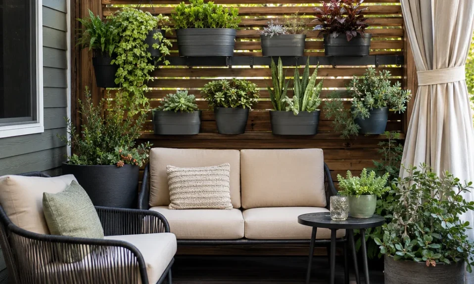
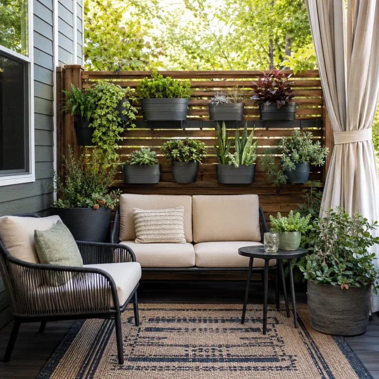
18. No Greenery or Natural Elements Anywhere in the Room
A room with no living things in it has a particular kind of stillness that isn’t peaceful — it’s just empty.
Greenery does something that no amount of furniture or art can replicate: it brings the eye to rest on something alive and changing. You don’t need a jungle. One large plant in a corner or two medium ones on different surfaces shifts the energy of a room in ways that are genuinely hard to explain until you try it.
Low-maintenance options like pothos, snake plants, and ZZ plants cost under $20 and require almost no attention.
A room with a plant in it feels like someone lives there.
17. Every Piece of Furniture Facing Only the Television
When the TV is the only reason furniture is arranged the way it is, the room stops being a living room and becomes a screening room.
This arrangement makes conversation awkward — people have to turn away from the screen to speak to each other, or they just don’t. A conversation zone within the room, even a small one, changes how the space is used and how guests feel in it. Angle one chair slightly away from the TV toward the sofa and you’ve created an invitation.
Rooms designed only around television watching tend to feel transactional rather than welcoming.
The TV will still be perfectly watchable. The room will be more livable.
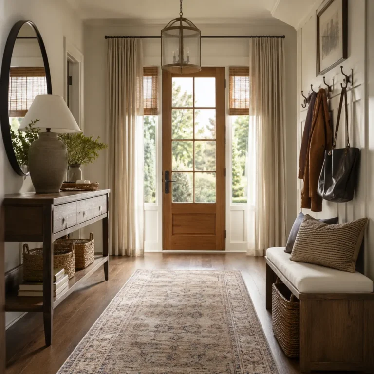
16. Curtains That Don’t Extend Past the Window Frame on Either Side
Curtains that just cover the window make the window look smaller and the room feel boxed in.
When panels hang only over the glass, they block light when closed and look pinched when open. Extend the rod 8 to 12 inches past the window frame on each side and the window reads as a full, generous architectural feature rather than a hole in the wall. The room gets more light when the curtains are open, and the window looks dramatically larger.
This fix costs nothing if you already have the curtains — just move the rod and add a bracket.
Windows are one of the most valuable things a room has. Let them be as large as they actually are.
Interior designers fix this next group before they touch a single piece of furniture.
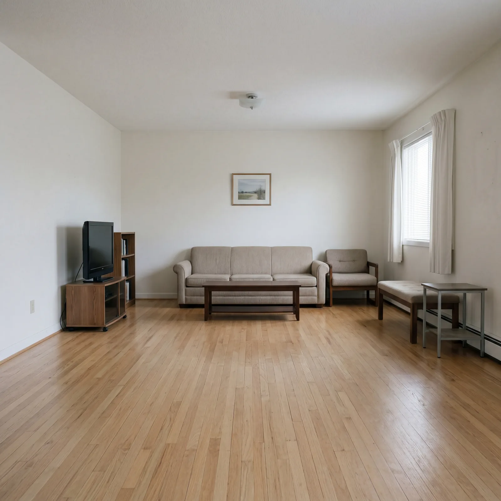
15. No Focal Point — The Room Has No Anchor
A room without a focal point is a room where your eye enters and immediately doesn’t know where to go.
It drifts. It scans. It gets tired. A focal point is the thing the room is oriented around — a fireplace, a large piece of art, a feature wall, a well-styled bookcase. If your room doesn’t have one, everything in it feels slightly random, no matter how nice each individual piece is. Create one deliberately: hang a large mirror, add a gallery wall, or paint a single wall a contrasting color.
The focal point is the sentence the room is trying to say. Without it, the room is just words.
Every well-designed room can answer the question “what do you look at first?”
14. Matching the Sofa, Loveseat, and Armchairs in the Same Exact Fabric
The matching suite felt like a safe choice in the showroom. In the room, it reads as stiff and slightly institutional.
When everything matches exactly, nothing has personality. The eye takes it all in at once and moves on. Mixing a sofa in one fabric with chairs in a complementary but different texture — linen with velvet, or solid with a subtle pattern — creates the layered, curated feel that rooms in design magazines have. You don’t need to replace anything. Reupholstering just the accent chairs can cost as little as $150 to $250 each and changes the whole read of the room.
Coordinated is the goal. Identical is the mistake.
A room that looks like it was purchased as a set usually feels like it was never quite finished.
13. Over-Styled Shelves That Look Like a Catalog Shoot With Nothing Personal
There is a version of styled shelves that looks beautiful in photographs and deeply uncomfortable in person.
It’s the shelf where every object is chosen for aesthetics and nothing is actually yours. No photos, no books you’ve actually read with worn spines, no oddly shaped thing you picked up on a trip. Guests walk past it and feel nothing. The fix is to remove two-thirds of the styled objects and replace some of them with things that are genuinely yours — even if they’re imperfect.
Authenticity on a shelf does more for a room than any amount of styling.
A shelf that tells your story is always more interesting than one that tells no story at all.
12. Empty Corners Left as Dead Space
Corners are not dead space. They are opportunity that most people walk past every single day without recognizing.
An empty corner in a living room creates a feeling that the room is unfinished — like a sentence that stops mid-thought. A floor lamp, a tall plant, a small reading chair and side table, even a tall vase with dried stems: any of these transforms a corner from a void into a moment. A good floor lamp costs $50 to $150 and does double duty as lighting and visual anchor.
Every corner in your room is a chance to make someone stop and look.
Stop leaving corners empty and start treating them as the design opportunities they actually are.
The items from here forward are the ones that cost the most — in time, money, and the feeling of a room that never quite worked.
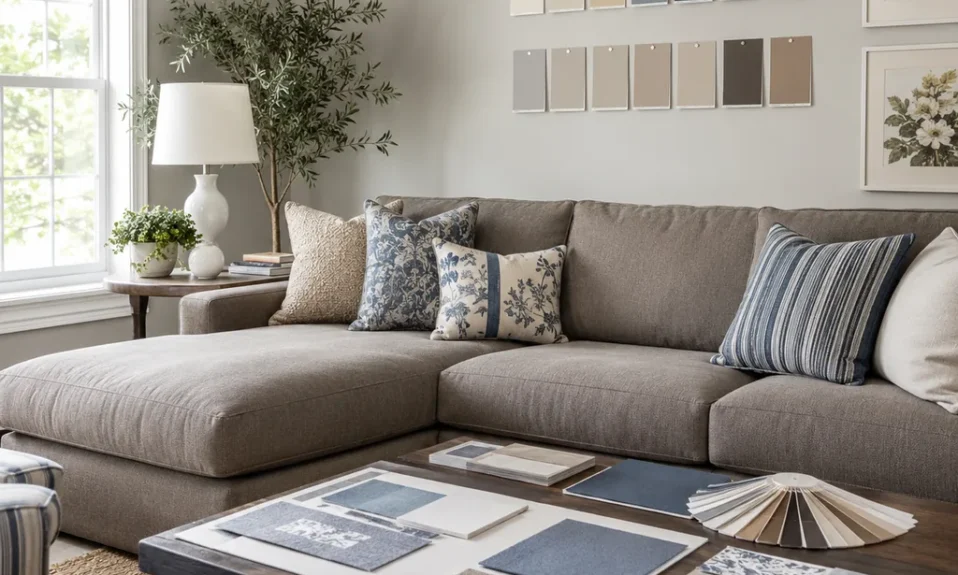
11. The Wrong Paint Color for the Room’s Light Exposure
Paint color is not just a preference. It is a direct interaction between pigment and the specific light in your specific room — and getting it wrong makes the entire room feel off in a way that’s almost impossible to diagnose without knowing why.
A warm cream that looks beautiful in a south-facing room turns orange and muddy in a north-facing one. A cool gray that’s sophisticated in bright light goes flat and sad in a dim room. The fix is a large test patch — at least 12 by 12 inches — painted directly on the wall and observed at different times of day before committing. This step alone saves hundreds of dollars in paint you’ll want to redo.
The color on the chip is not the color on your wall. It never is.
Light changes everything, and your paint color lives in your light, not the store’s light.
10. Area Rug Not Large Enough to Anchor All the Furniture Legs

This appears twice on this list because it is genuinely that common and that impactful — and because the version at #27 is about proportion, while this one is about anchoring.
A rug that sits only under the coffee table while the sofa and chair legs float on bare floor makes the furniture grouping feel like it hasn’t decided where it belongs. At minimum, the front two legs of every major seating piece should rest on the rug. Ideally all four. An 8×10 or 9×12 rug is almost always what a standard living room actually needs, not the 6×9 that most people buy because it seems large enough in the store.
The rug is the foundation the room is standing on. If the foundation is too small, nothing above it feels stable.
Buy the bigger rug. You will not regret it.
9. Sofa Scale Wrong for the Room — Too Large or Too Small for the Space
The sofa is usually the most expensive single piece in a living room, which makes getting its scale wrong an expensive and demoralizing mistake.
A sofa that’s too large for the room makes every other piece look like an afterthought and leaves no circulation space — the room becomes hard to move through and harder to relax in. A sofa that’s too small makes the room feel underfurnished, like the main character is missing. Before buying, tape out the footprint on the floor and live with the outline for a day. It takes twenty minutes and prevents a mistake that costs $800 to $3,000 or more to undo.
The sofa sets the scale for everything else in the room. Get it wrong and everything else has to apologize for it.
Measure twice. Tape once. Then decide.
8. Missing a Reading Chair or Second Conversation Spot
A room with only a sofa is a room with only one thing to do in it.
The reading chair — or the accent chair, or the small loveseat in a corner — is what separates a living room from a TV room. It creates a second option: somewhere to sit that isn’t facing the screen, where a conversation can happen at an angle, where a person can read with good light while someone else watches something. A well-chosen accent chair costs $150 to $400 and changes the entire function of the room.
The question a living room should answer is: what can we do here? A sofa alone only answers it one way.
Give the room more than one answer and it becomes somewhere people actually want to spend time.
7. No Layered Lighting — Only Overhead, No Table Lamps or Accent Lights

This one appears twice in slightly different form because lighting is the single most underestimated element in residential design — and because most living rooms have exactly one light source when they need at least three.
Overhead light is functional. It’s the light you use to find things. It is not atmosphere. Table lamps at seated eye level do something overhead light physically cannot: they create warmth, they make faces look good, and they signal that the room is meant for staying in rather than passing through. Two lamps on a dimmer switch do more for an evening living room than almost any other single change.
The right lighting makes everything else in the room look better, including the people in it.
Light is not decoration. It is the condition everything else depends on.
You’re in the top seven now. These are the ones that have the longest reach — fixing them changes multiple things at once.
6. Wrong Sofa Depth for the People Using It

The ultra-deep sofa looks extraordinary in the showroom and in photographs. For anyone under about 5’5″, it is a daily source of low-grade physical discomfort.
Sofa depth — the measurement from the front edge of the seat to the back cushion — typically ranges from 20 to 26 inches. Anything over 22 inches starts to become uncomfortable for shorter-framed people because your back can’t reach the cushion without your legs dangling. The problem is almost invisible until you’re living with it. Test the sofa seated for at least five minutes before buying, legs on the floor, back against the cushion.
A sofa that isn’t comfortable to sit in is furniture that everyone subtly avoids.
The most beautiful sofa in the world fails if no one actually wants to sit on it.
5. Paint Color Chosen From a Tiny Chip Without a Large Test Patch on the Wall

Paint chips are optimists. They show you the color under ideal lighting conditions, at a size too small to read accurately, against a white background that will never be the context the color actually lives in.
The color you chose from a 1-by-2-inch chip will be a different color on your wall — sometimes dramatically so. The fix is a test patch of at least 2 by 2 feet painted directly on the wall, observed in morning light, afternoon light, and evening artificial light before you buy 2 gallons and commit. Many people skip this step because it feels fussy. Every designer does it without exception.
A bad paint color is one of the most expensive mistakes to live with and one of the cheapest to prevent.
Spend $5 on a sample pot before spending $80 on full paint. The math is obvious when you say it out loud.
4. No Texture Variation — Everything the Same Material or Sheen
A room where everything is the same texture is a room that photographs beautifully and feels slightly wrong to sit in, though most people can’t say exactly why.
Texture is what gives a room physical warmth. The contrast between a linen sofa and a velvet cushion, a smooth marble coffee table and a jute rug, a matte wall and a glazed ceramic lamp — these differences are what the hand and the eye crave when they encounter a room. Mix at least four distinct textures in any seating area: something woven, something smooth, something soft, something with weight. This costs nothing if you already have pieces in the room — it’s just about selecting and placing them intentionally.
Texture is the thing your guests feel in a room before they consciously register what they’re looking at.
A room with no texture variation is technically furnished but sensory-starved — and people notice, even if they can’t name it.
3. Furniture Arranged for the Shape of the Room, Not for Conversation

Rooms are geometric. People are not. And furniture arranged to fit the geometry of the room almost always fails to fit the human beings who need to use it.
When you arrange furniture for the shape of the room — two chairs in the corners, sofa parallel to the longest wall, everything equally spaced — you get a room that looks correct in a floor plan and feels awkward to actually sit in. Conversation across 10 to 12 feet is uncomfortable. It encourages people to raise their voices or stop talking. The fix is to create a seating cluster where no two seats are more than 8 feet apart, regardless of where that puts the furniture relative to the walls.
Rooms are for people, not for floor plans. Arrange for the conversation first.
A room that people love to be in almost always has a seating arrangement that feels slightly rule-breaking from above — and completely natural from inside it.
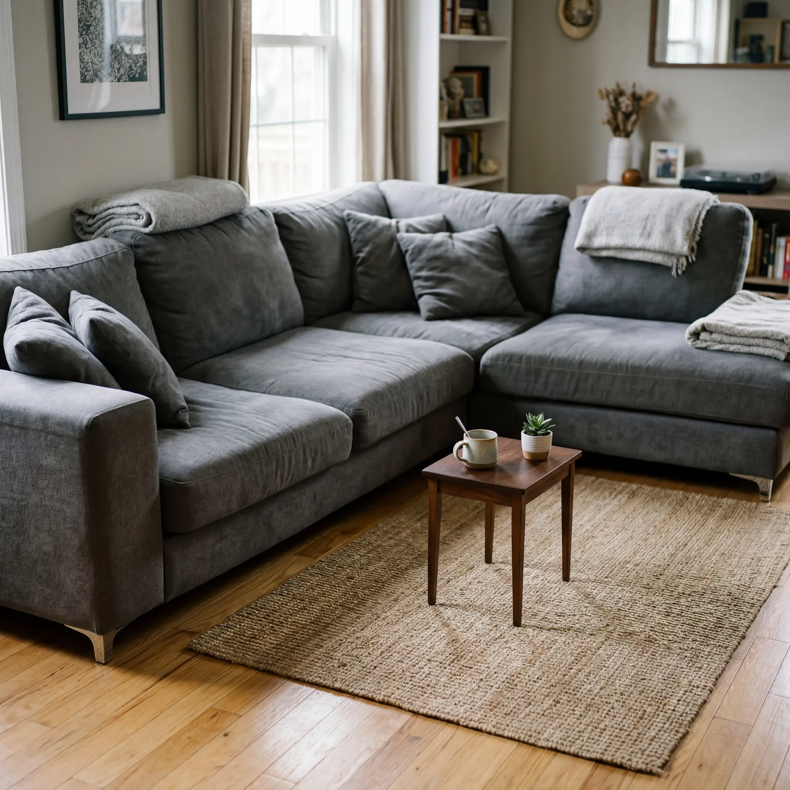
2. No Coffee Table, or Coffee Table Too Far From the Sofa to Be Useful
The Missing Center
The coffee table is not decoration. It is the operating surface of the living room — where drinks go, where books land, where remotes live, where someone rests their feet after a long day.
A room without a coffee table forces everyone to hold their drinks, look for surfaces, and feel subtly unsettled without knowing why. A table that’s pushed more than 18 inches from the front of the sofa might as well not be there — it’s too far to reach without leaning forward, and no one uses something that requires effort just to access. The ideal distance is 14 to 18 inches from the front edge of the sofa to the nearest edge of the table.
If you have no coffee table, a simple solid wood option starts at around $80. If your table is too far away, just move it. This is a thirty-second fix that changes how the room functions every single day.
The coffee table is the anchor of the conversation zone. Without it, the seating group is just chairs in proximity.
It’s bad. But it doesn’t come close to what’s waiting at #1.
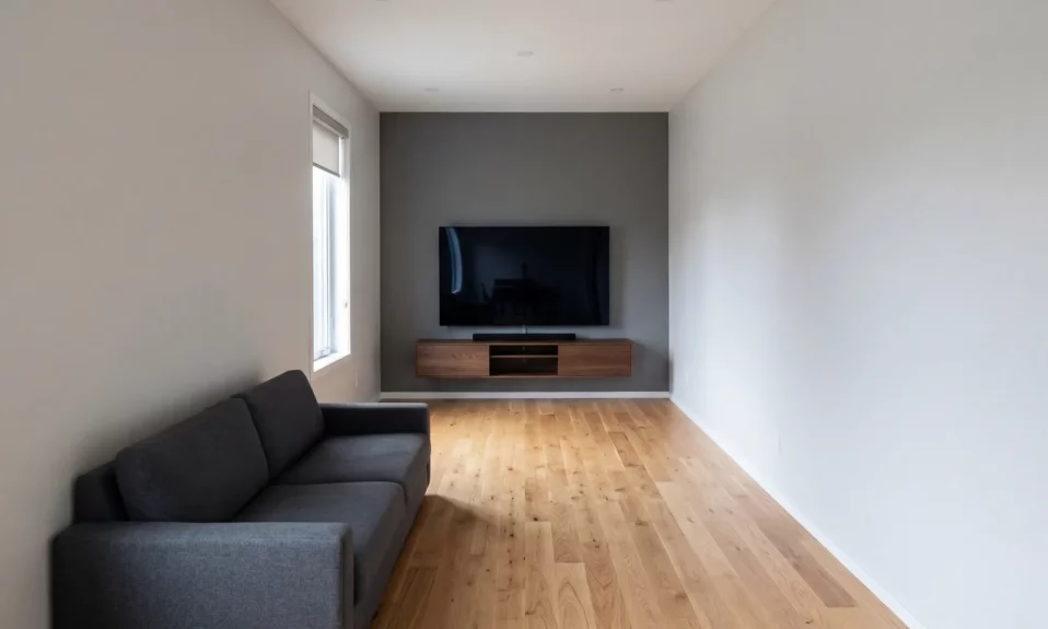
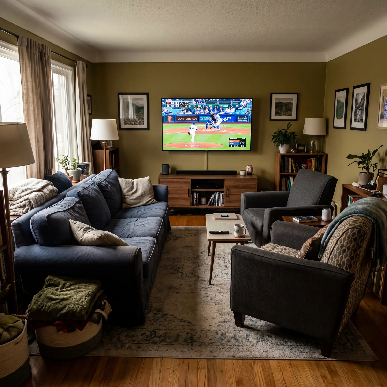
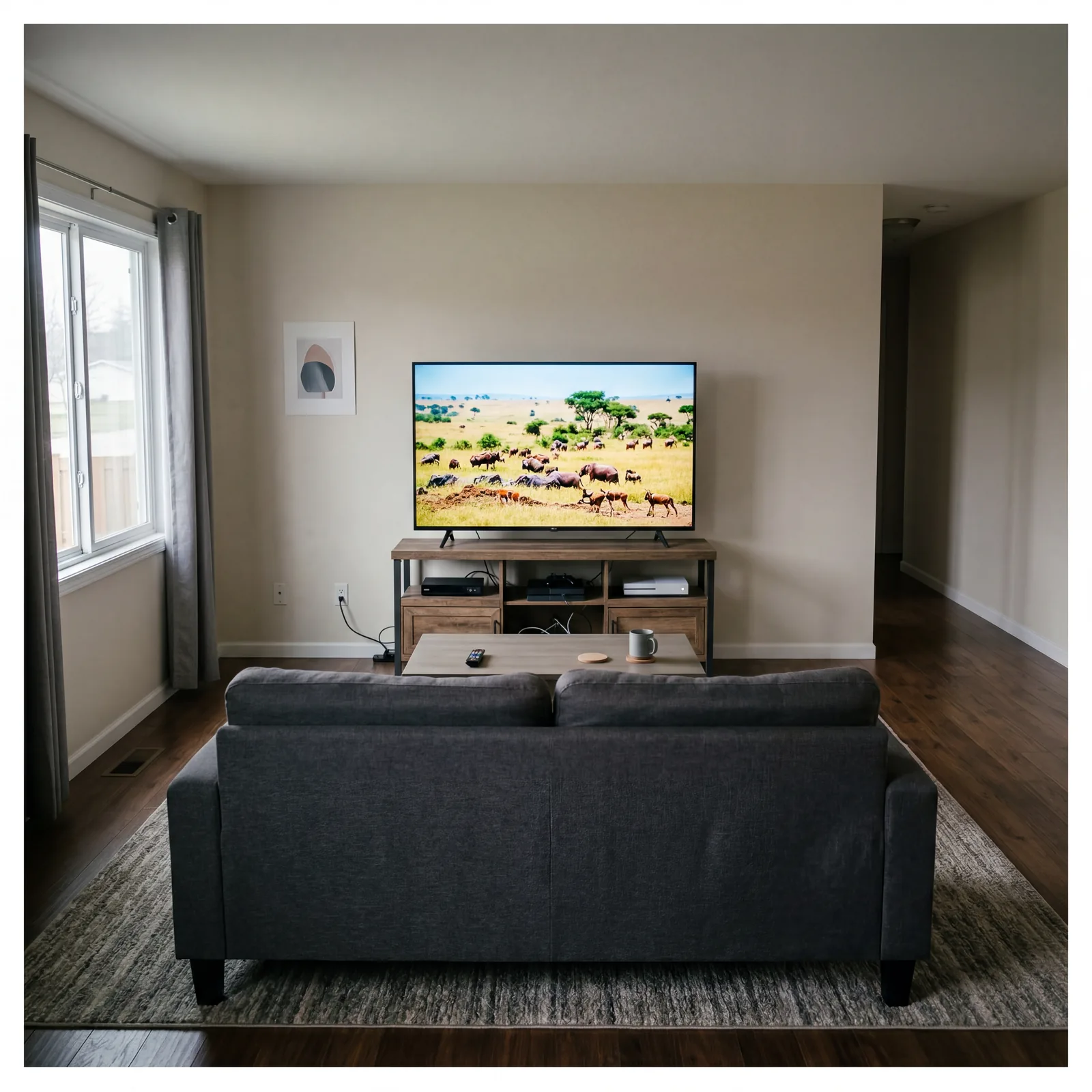
1. The Sofa Against the Wall Directly Opposite the TV With Nothing Else in Between
The One That Makes Every Other Fix Pointless
This is the arrangement that most living rooms default to. It feels logical. It feels safe. It is quietly responsible for making more living rooms feel cold, small, and impossible to fix than any other single decision.
When the sofa sits flat against the back wall with the television on the opposite wall and nothing in between, you have created a tunnel. The eye travels from the sofa to the screen and back again with no resting points, no warmth, no reason to look anywhere else. The room communicates one thing: this space exists to watch television. It repels conversation. It makes the room feel longer and narrower than it is. It turns guests into an audience.
Every other fix on this list — the rug, the lighting, the curtains, the art — is significantly harder to pull off in this arrangement because the fundamental logic of the room is working against them. Floating the sofa even 24 inches from the wall, adding a console table behind it, placing lamps at either end, and introducing a secondary seating piece at an angle: these four changes together restructure everything.
A retired interior decorator from Georgia told me she stops counting how many times she’s walked into a living room laid out exactly this way. “It’s the arrangement people choose because they’ve seen it everywhere,” she said. “They’ve seen it everywhere because everyone copies it. Nobody stops to ask whether it’s actually working.”
Now look at your living room. There’s a good chance this one is already there — and you’ve been working around it for years.
Worth Knowing Before You Rearrange
None of these fixes require a renovation, a designer, or a large budget — most of them cost nothing at all and take less than an afternoon to test. The living room you want is almost certainly closer than you think, sitting inside the arrangement you’ve stopped questioning. If one of these landed differently than the others, drop it in the comments — or send this to someone whose living room you’ve always wanted to gently help.