
Your home’s color tells the story before anyone opens the door.
People drive past and decide in three seconds whether they love a house or barely notice it. That’s not the landscaping. That’s the paint.
The combinations on this list work because of how colors interact with each other, with natural light, and with the architecture underneath them. Most of them cost under $300 to apply. Some cost under $50.
The combination at #1 works on almost any home. It’s been working for decades. It’ll be working long after the current trends fade.
Here are 25 front porch color combinations worth knowing before you pick up a brush.
25. Classic Black Door with Brick Exterior and White Trim
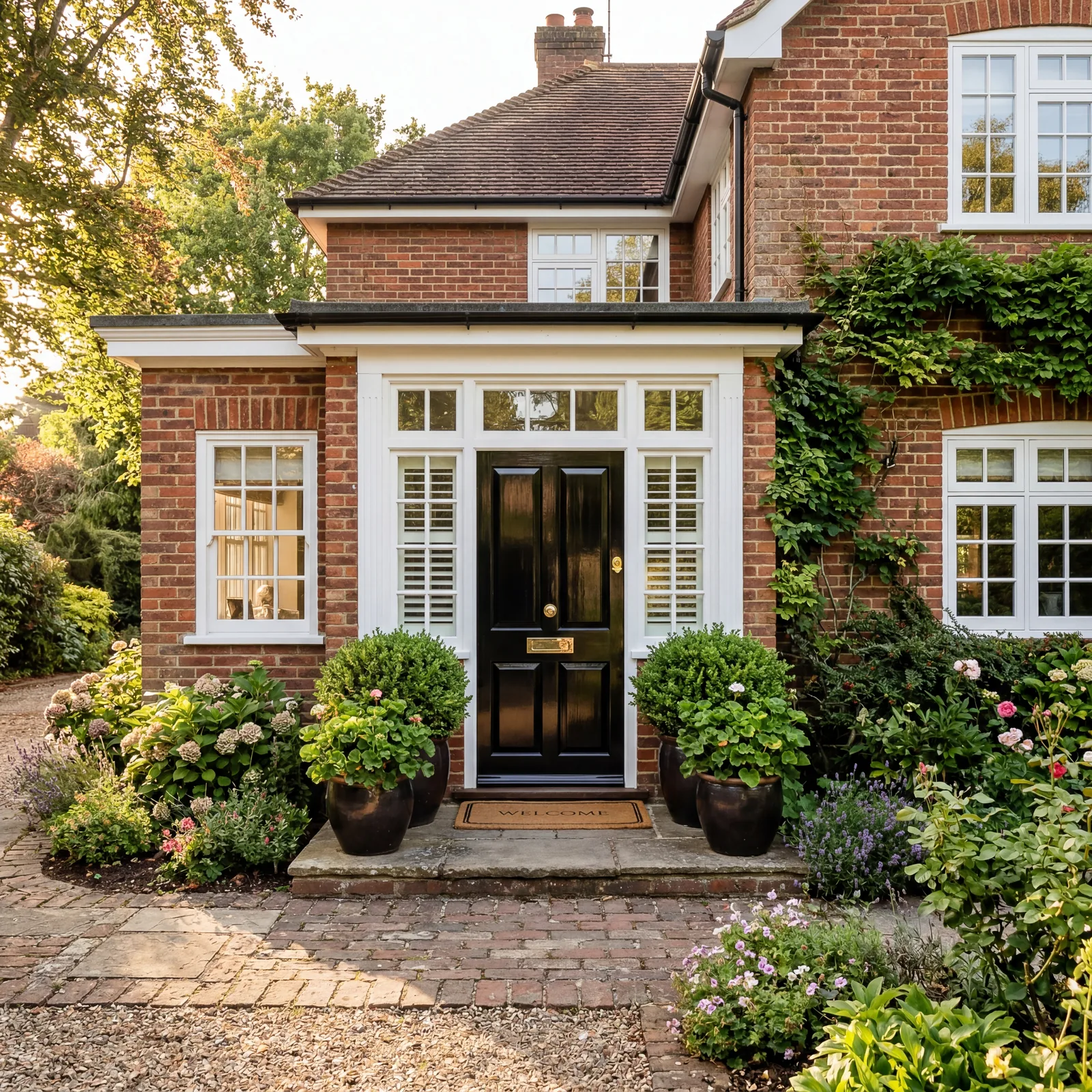
Black on brick is one of the oldest combinations in American home design. It works because it doesn’t compete with the brick.
The brick provides the warmth. The black door delivers the authority. White trim handles the contrast.
Benjamin Moore Jet Black (2120-10) in a high-gloss finish elevates any brick exterior immediately.
It’s been working since 1950. It’ll be working in 2050.
24. Navy Blue Door with Light Grey Siding
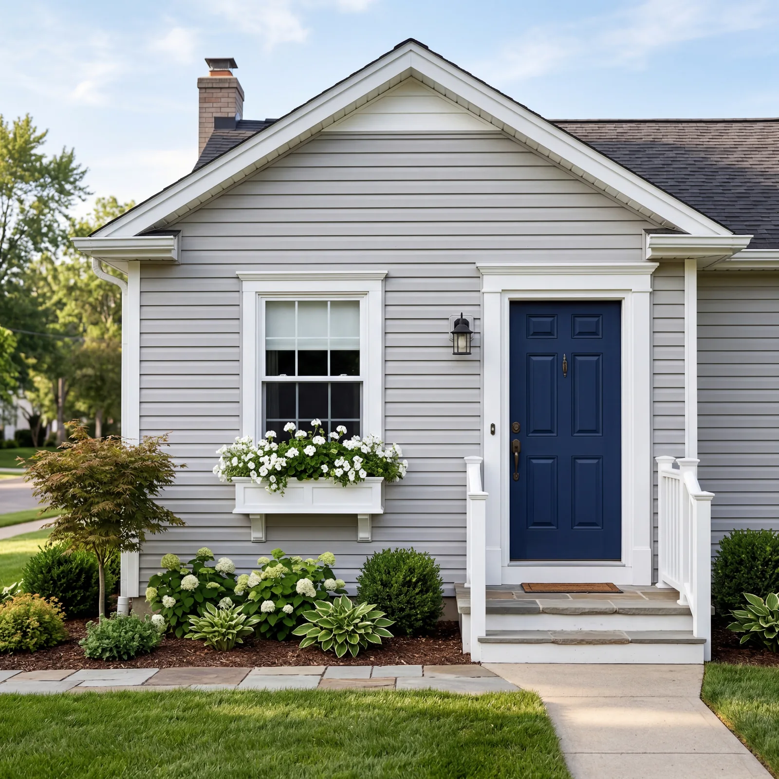
Navy against light grey is one of the most searched color combinations in every home design forum for good reason.
The cool tones play off each other without clashing. The navy reads as authoritative and clean rather than heavy.
Sherwin-Williams Naval (SW 6244) is the most commonly specified color in this pairing. It hits the sweet spot between blue and almost-black.
Light grey siding is one of the most common exteriors in suburban America. This door transforms it.
23. Forest Green Door with Cream or Off-White Exterior

Green has been the color of choice for traditional American homes for over a century. Forest green against cream is warmer than you’d expect.
It looks like the inside of a private club and a welcoming home at the same time. The cream doesn’t compete. That’s exactly why it works.
Benjamin Moore Salamander (2050-10) consistently looks best in this pairing.
Some combinations don’t need reinventing.
22. Classic Red Door with White Colonial Exterior
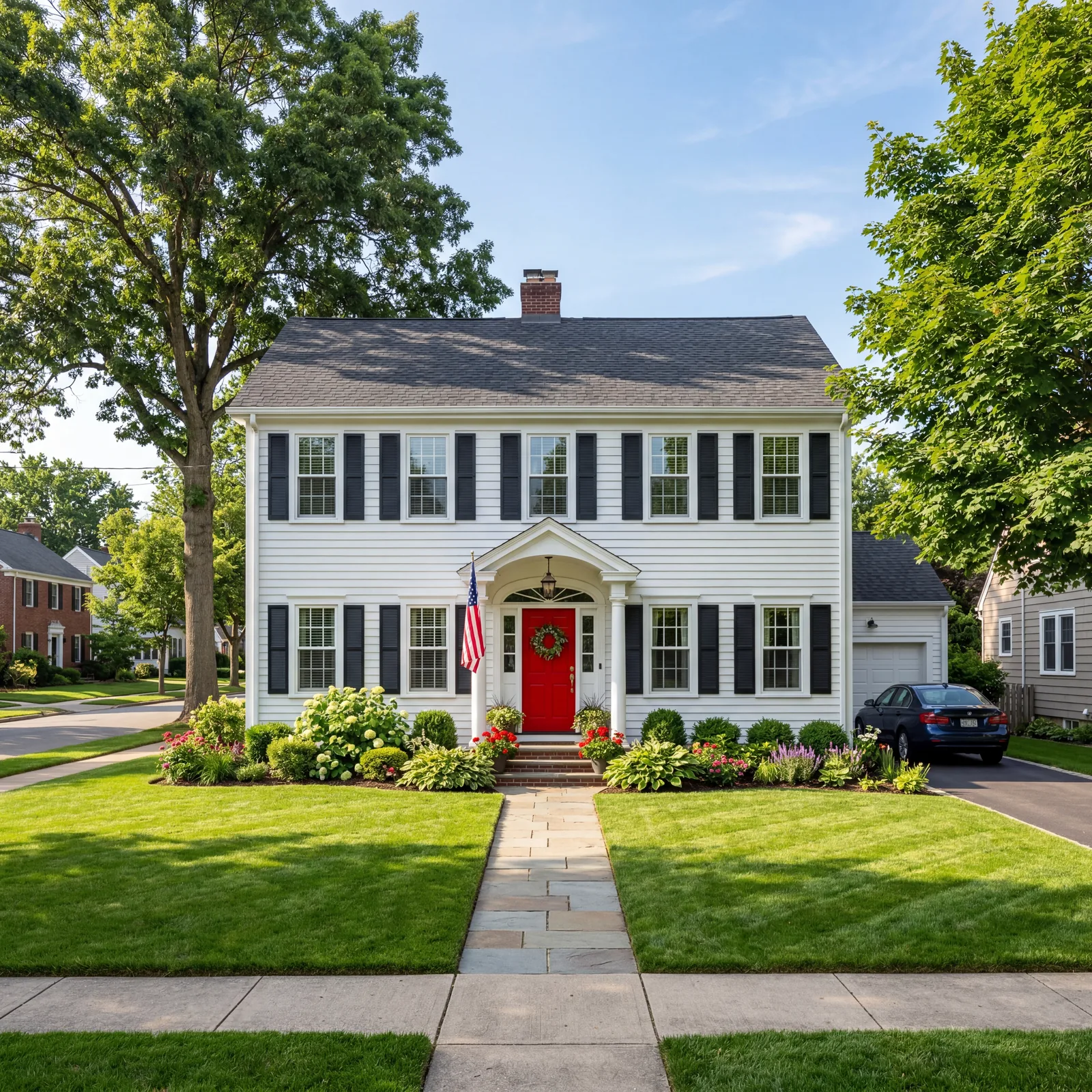
Red doors have meant welcome in American home design since the colonial era.
A red door on a white colonial with black shutters is one of the most recognized combinations in residential architecture. It’s patriotic without trying to be. Classic without being dated.
Benjamin Moore Caliente (AF-290) is the red that decorators reach for when the client wants timeless rather than trendy.
Some combinations get better with age. This is one of them.
21. Pale Yellow Accents with White Farmhouse Exterior
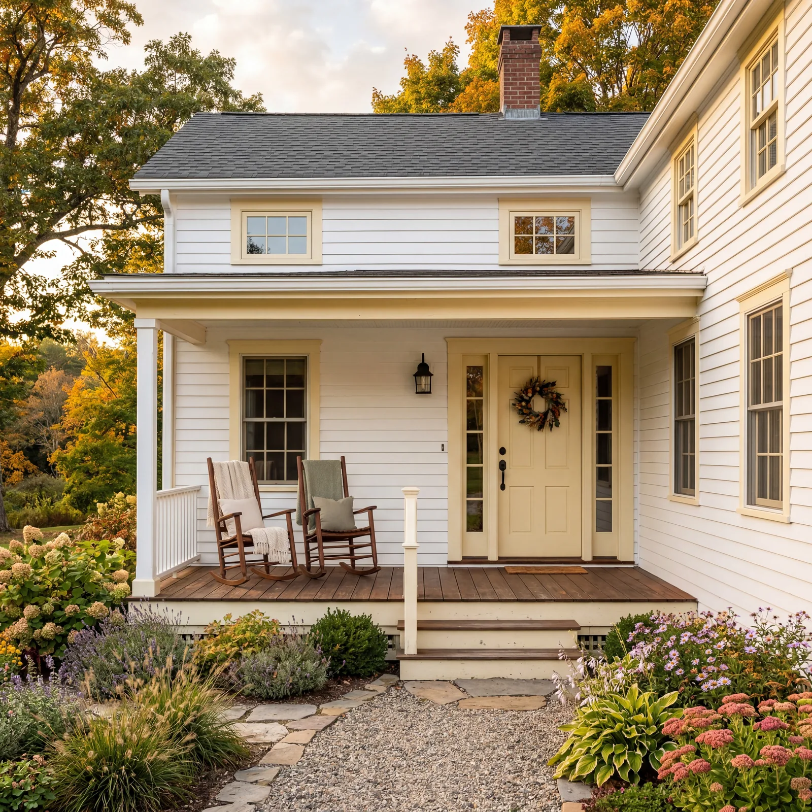
Yellow reads as joy. Pale yellow reads as comfort.
On a white farmhouse, pale yellow accents on the door, shutters, or window boxes bring a warmth that white alone never achieves. It looks like the house has always been this cheerful.
Sherwin-Williams Butter Up (SW 6681) is soft enough to read as cream in morning light and warm gold in the afternoon.
A little yellow goes a long way. It doesn’t need to shout.
This next one is a Southern tradition that’s become nationally popular.
20. Haint Blue Porch Ceiling with White Exterior

The haint blue porch ceiling started in the Lowcountry South. It’s spread to every state because it’s genuinely beautiful.
The blue-grey makes a covered porch feel open to the sky. It adds depth and history without any drama.
Sherwin-Williams Watery (SW 6478) is the most specified haint blue in the current market. On a white exterior, it adds exactly the right note of calm.
You’ll spend more time on your porch once you paint it this color.
19. Warm Sage Green Door with Natural Stone Exterior
Stone and green are one of the most natural pairings in architectural color. Sage green on natural stone looks like it was always there.
Like the house grew out of the earth and the door chose itself.
Benjamin Moore Rosemary (HC-166) is the sage that photographs best on stone exteriors. It’s not too grey and not too yellow.
Most people driving past a home with this combination slow down without knowing why.
18. Charcoal Door with Board and Batten Siding
Board and batten has had a design moment that hasn’t ended. The right door color makes it look intentional rather than trendy.
Charcoal is more sophisticated than pure black and works better with white board and batten because it creates depth rather than hard contrast.
Sherwin-Williams Peppercorn (SW 7674) is the charcoal specified more often in the last decade than almost any other exterior dark tone.
It’s a door color that says this house has a point of view.
17. Coastal White with Navy Shutters

Navy shutters on white are the definition of East Coast classic.
This combination works equally well inland. The navy reads as established and composed rather than nautical once you get away from the water.
Sherwin-Williams Anchors Aweigh (SW 0010) for the shutters. Sherwin-Williams Alabaster (SW 7008) for the body. White trim is always white trim.
Some combinations transcend region. This is one of them.
The next four combinations are ones most people haven’t considered but immediately love when they see them.
16. Terra Cotta Accents with Stucco Exterior
Terra cotta on stucco is warm in a way that tropical colors rarely are.
Both materials have the same energy: sun-baked, settled, unhurried. The combination looks like New Mexico even in a Connecticut neighborhood.
Benjamin Moore Moroccan Spice (2170-30) is the terra cotta that reads as rich rather than orange in natural light.
If your home is stucco, this is often the combination it was always meant to have.
15. Deep Burgundy Door with Grey Stone Exterior

Burgundy on grey stone is dramatic in the way that makes guests pause before ringing the doorbell.
It’s not aggressive. It’s distinguished. The cool stone makes the warm burgundy look richer than it would on a painted surface.
Benjamin Moore Raspberry Truffle (2083-20) reads plum in low light and deep red in midday sun.
This is a combination that makes a stone home look like it belongs on a magazine cover.
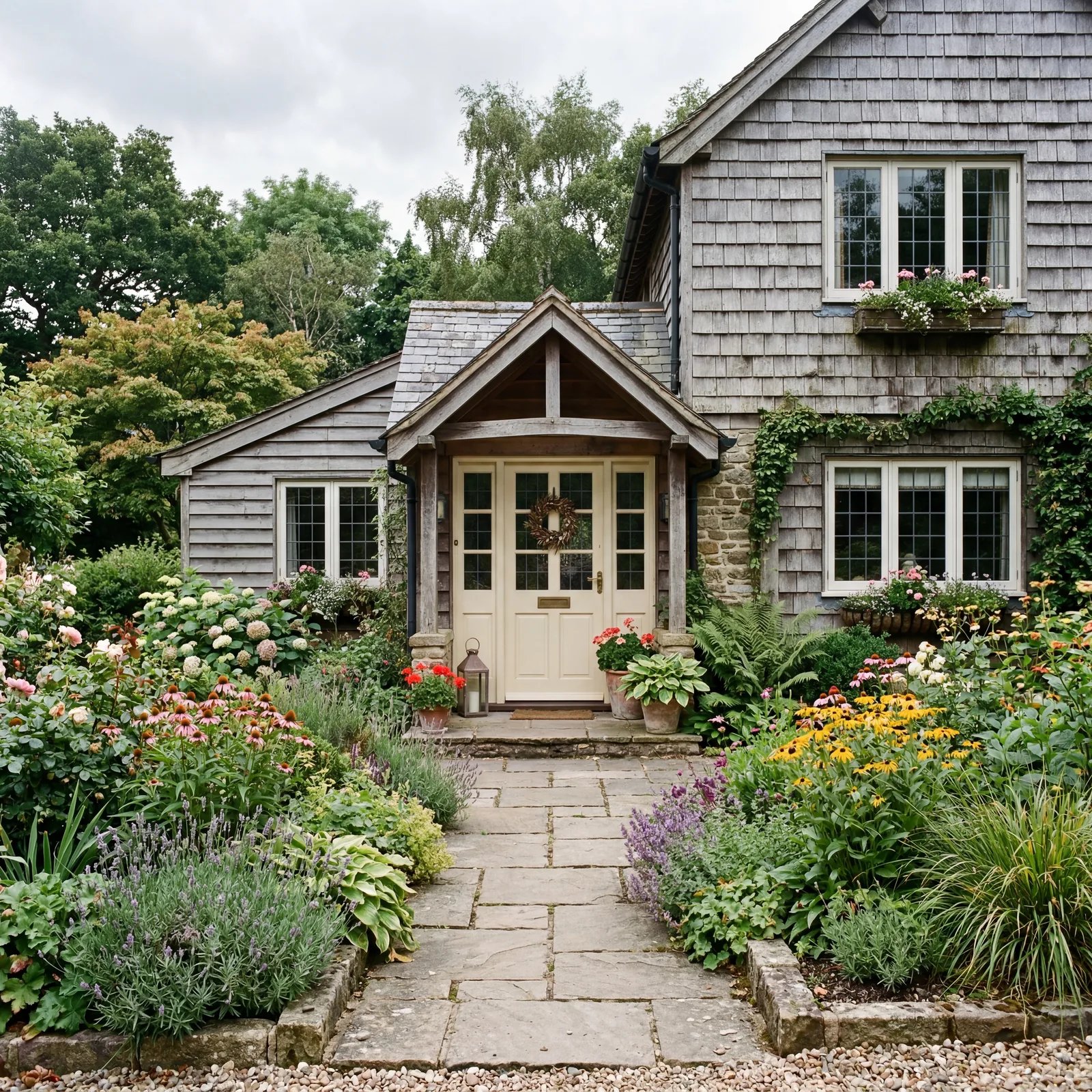
14. Matte Black Door with Cedar Shake Shingles
Cedar shake is a natural material. It needs an anchor. Black provides one without arguing with the wood.
Without a dark anchor, cedar shake can look unfinished. A black door and black hardware give the organic texture a precise edge.
The black needs to be a true black, not a dark brown or dark grey. The contrast is the point.
Cedar shake homes that get this combination right look like they cost twice as much as they do.
13. Soft Lavender Door with White Craftsman Exterior

Lavender is the surprise on this list. Most people haven’t considered it. Those who try it don’t go back.
On a white craftsman, lavender is gentle and confident at the same time. It says the people inside are creative and unafraid of color.
Sherwin-Williams Violet Mist (SW 6836) is soft enough that it reads between lilac and grey in most light conditions.
The window boxes finish it. White flowers or purple both work.
12. Warm Cream Door with Weathered Wood Siding
Weathered wood needs warmth to keep it from reading as cold and abandoned. Cream is warm without trying to match the wood’s undertones.
Benjamin Moore White Cream (OC-7) reads as antique parchment against weathered grey. Softer than white and warmer than ivory.
This combination photographs beautifully even in grey, overcast light.
The home looks like it was built by someone who understood color from the start.
11. Olive Green with Warm Tan Stucco

Olive green and warm tan is a combination that belongs to sun-baked climates but works anywhere.
The olive carries green’s natural associations without the brightness that makes other greens clash with warm stucco tones.
Sherwin-Williams Basil (SW 6194) consistently earns compliments on tan and warm beige stucco exteriors.
It’s the combination that makes a perfectly ordinary Mediterranean-style home look intentional.
10. Cobalt Blue Door with White Adobe

Cobalt on white adobe stops cars. It’s the Southwestern equivalent of the red door on a colonial.
The adobe white makes cobalt look jewel-like against it. It reads as joyful rather than loud.
Benjamin Moore Brilliant Blue (2065-20) is deep enough to feel intentional and bright enough to read from the street.
Not every home can carry this. Adobe and stucco can.
These next two combinations are the ones most people haven’t tried but absolutely should consider.
9. Dusty Pink Door with Grey Craftsman Exterior
Dusty pink on grey sounds wrong until you see it. Then it makes complete sense.
The grey grounds the pink. The pink lifts the grey. Neither color performs as well alone.
Sherwin-Williams Mellow Coral (SW 6876) doesn’t read as baby shower. It reads as sophisticated and unusual in the best way.
Every house on the block will be white, navy, or black. This one will be the one people remember.
8. Teal Door with White and Natural Wood Accents
Teal belongs to every decade without being from any of them. Against white with natural wood accents, it’s warm and coastal without being a beach theme.
The wood keeps it grounded. The white keeps it clean. The teal does the talking.
Benjamin Moore Teal Ocean (2055-30) is deep enough to feel authoritative and bright enough to feel welcoming.
It’s a door color that makes people want to know who lives inside.
7. Unlacquered Brass Hardware on Any Dark Door
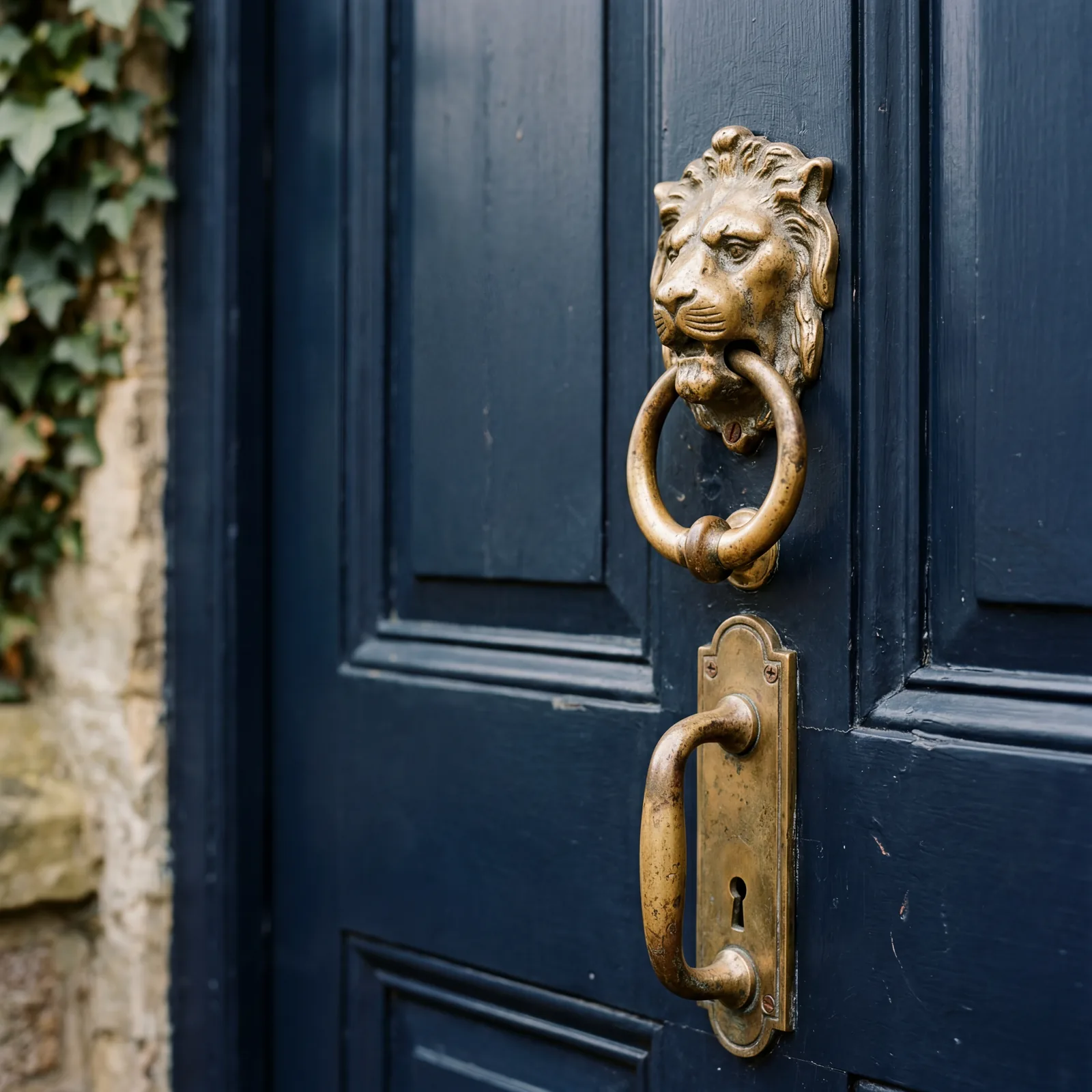
The hardware is the jewelry of the front door. Most people choose it last and spend the least on it.
Unlacquered brass and oil-rubbed bronze are the two hardware finishes that elevate a dark door in a way that chrome and nickel never do. Both add warmth. Both photograph beautifully.
A good handle and knocker set runs $60 to $150. It’s the one detail that makes people slow down before they ring the bell.
The door color gets noticed. The hardware is what makes people want to touch it.
6. Two-Tone Porch Floor: White Deck with Dark Grey Border

Most porch floors are painted a single, indifferent color. Two-tone tells you the owners thought about it.
White deck boards with a 12-inch dark grey border is a traditional treatment that dates to the Victorian era. It costs nothing extra to do. It makes a porch look finished rather than merely functional.
Sherwin-Williams Porch and Floor Enamel in both tones. The dark border is usually Pewter Mug (SW 7673).
A porch floor people comment on is a porch people want to sit on.
5. Dark Exterior Trio: Black House, Forest Green Shutters, White Trim
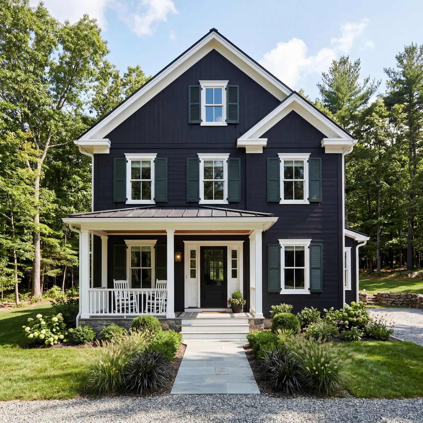
This combination is not for every neighborhood or every personality. Where it works, it commands.
Black exteriors have been one of the most saved home colors on every design platform for years running. Forest green shutters break the monotony without softening the drama. White trim delivers the precision.
Sherwin-Williams Tricorn Black (SW 6258) for the body. Benjamin Moore Hunter Green (2041-10) for the shutters.
This is the combination that stops people mid-drive and makes them wonder what the inside looks like.
4. Blue-Grey Farmhouse with White and Natural Wood
Blue-grey works in every region, every season, and every style of home. It’s versatile not because it’s neutral but because it adapts to what’s around it.
Benjamin Moore Newburyport Blue (HC-155) looks different in morning light, afternoon light, and overcast conditions. It looks good in all three.
Natural wood shutters add warmth. White trim adds clarity. The combination feels complete without effort.
Most people who choose this color say they should have done it sooner.
3. White House, Black Shutters, Red Door

This is the combination that appears more in American home design history than any other.
White says clean. Black says defined. Red says welcome. Each color does exactly one job.
Benjamin Moore Caliente (AF-290) for the red. Benjamin Moore Onyx (2133-10) for the shutters.
Every era of American home design has claimed this combination as its own. That’s not an accident.
It’s bad. But it doesn’t come close to what’s waiting at #1.
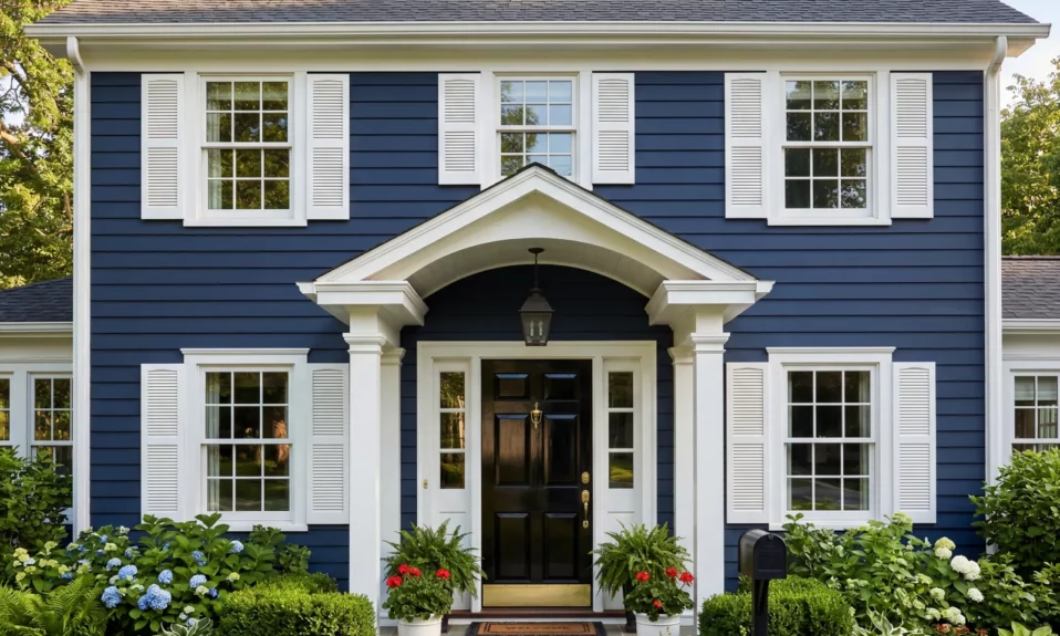
1. Deep Navy Exterior with Bright White Trim and Gloss Black Door
The One That Works on Every Home
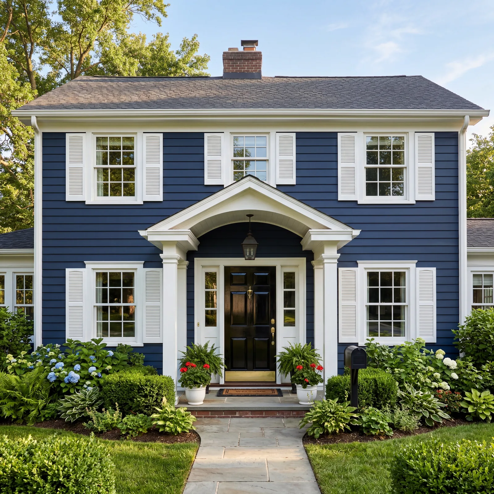
Every color on this list works in the right context. This one works in every context.
Navy is the color designers choose when they want a house to look like it has been there for 150 years and will be there for 150 more. It photographs better than almost any other exterior color in both bright sun and overcast light. It recedes during the day and deepens in the evening.
Sherwin-Williams Naval (SW 6244) for the body. Sherwin-Williams Extra White (SW 7006) for the trim. A high-gloss black for the door.
The gloss black door is what makes the combination feel complete. Flat black feels unresolved. Gloss black closes the loop. The sheen echoes the trim without matching it and pulls every element into alignment.
A retired interior designer from North Carolina told me that in 25 years of practice, she specified this combination — or a close version of it — on more homes than any other exterior scheme. “It never failed a client,” she said. “Not once.”
Navy doesn’t ask for approval. It already has it.
Now look at your home from the street. There’s a good chance this combination works better on your house than whatever color it’s wearing right now.
Worth Knowing Before You Pick Up a Brush
Color changes a home faster than any renovation. You can transform the entire front of your house for under $500.
Most people live with the original builder color for decades because they’re afraid to choose the wrong thing. These combinations take the guesswork out.
Which one are you considering? Share this with someone who’s been putting off painting their front door — it’s a two-hour project that changes how you feel about coming home every single day.